Colour

Colour Perception


The picture of the strawberries below is a well known optical illusion. Our brains perceive the picture as being under a blue light source, so automatically remove the blue components of the colour. This means we see the strawberries as red. But what happens if we zoom in on a 'red' section of strawberry? Click the image to take a closer look.

[Click image to zoom]

Why Does it Matter?


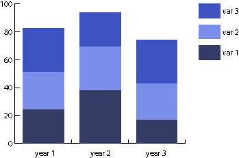
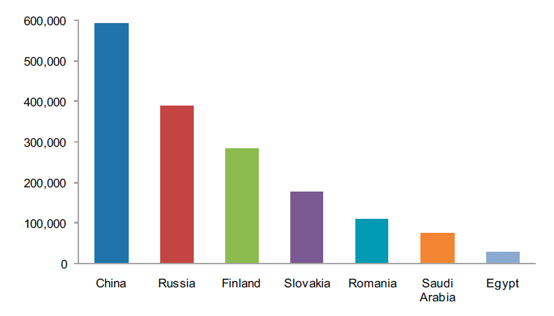
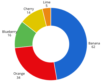
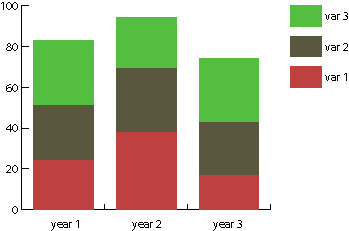
Look at the colour scheme in the chart below. You may instinctively feel that it is generally lacking in taste... but there are actually more fundamental problems with the choice of colour here.


Red-green colour blindness affects about 1 in 12 men and 1 in 200 women.
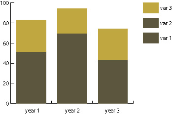
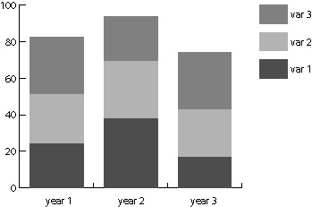
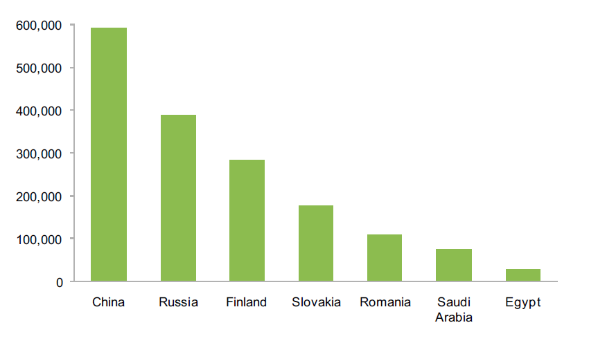
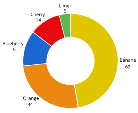
Vary by lightness


To ensure that most people can distinguish between the colours you choose, it is best to vary their lightness/luminance. Blue is generally considered a good first colour choice, since blues remain largely unchanged for most types of colour blindness.

Think carefully before choosing a colour scheme...

“Get it right in black and white”

Make sure your design works in greyscale before adding in colour. Don’t rely on colour alone to tell the story.


“The safest hue is blue

The richest colour across all types of colour blindness is blue, therefore blue is often a good colour choice.


Red and green should never be seen”

Difficult to distinguish from one another in the more common types of colour blindness.

Highlight Differences


Can you find the Ls and Is among all the Ts?


Are you sure you got them all? You probably did, as we've made this fairly easy. But it might have taken a few seconds to be sure.

We can make it easier for users to understand differences in data with sparing and sensible use of colour.

Always add meaning


Only use different colours when they represent helpful differences in the data.

In this chart, there is no meaning to the colour - the creator of the chart just thought it looked nice. The colours are a distraction from the real message in the data and can actually make it harder to get our key messages across.

Natural Associations


Some colours are associated with particular meaning.
E.g. Green is for good and red is for bad.

The colours in this chart are quite jarring as they go against our natural association between colour and fruit. Using unexpected colours to represent familiar concepts slows down information processing and forces the reader to work harder. Where possible, use colours that users would expect to see to represent familiar concepts.

Crowded Charts

If you have more than a handful of lines, it becomes difficult for viewers to quickly distinguish between the different colours. As a creator, you need to design your charts carefully to help the reader quickly understand what the data is telling them.

[Click image to enlarge]

A simple way to make lines easier to differentiate is by adding texture. This chart uses a mixture of solid and dotted lines to help the user. However, it still has so many lines that the viewer will need to spend time matching each line to the data it represents.

10. Use colour wisely