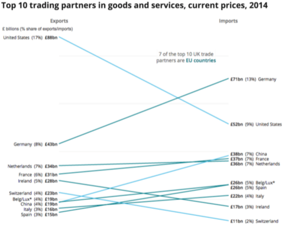
Design

Most of the judgements you will have to make will be in the design of the charts.

By now we should know our Who, Where and When (the audience and setting i.e. the context). We are clear on the Why (the purpose of the visualisation) and we have acknowledged the constraints imposed on us, so armed with this knowledge we can consider our design (i.e. what to show and how to show it).

We have been through personas earlier with Bart and Lisa, thinking about the need to define and serve your target audience. This is user-centered design.

User-centered design is about empathy. It's not enough to rely on your own instincts and be driven by your own tastes. The user need is what is important.

How do we best facilitate understanding and make the information useful?

Data visualisation design is a massive topic and we are not going to cover everything, but we will use case studies and examples to illustrate some important points

A lot of the content in this section comes from Style.ONS and work we have done in conjunction with ONS.

Angle and framing

In Andy Kirk's book he talks about Angle and Framing. By angle we mean consider what view is most relevant - Big picture or low level?

What are you measuring? Percentage, totals, change?

Are you breaking it down? Broken down by region, comparison over time?

Is one view sufficient? Can you explain what you want with only a single visual or do you need to cover different angles?

By framing, we mean what is the inclusion criteria? What do you show? What do you leave out? Is it representative?

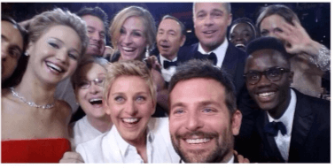
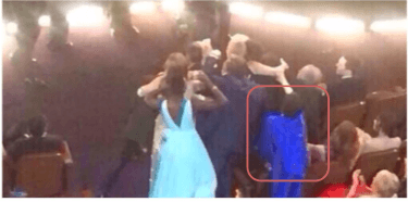
Remember this famous selfie? Can you see Liza Minnelli?

A selfie taken by Ellen Degeneres at the oscars that includes lots of different famous actors and actresses.

For another example of angle and framing let's look at this is a famous image of Diego Maradona being confronted by six Belgian players at the 1982 World Cup.

A famous picture of Maradona at the 1982 world cup with 6 Belgium players about to confront him

Relationships

Having decided WHAT you want to say (the angle, the framing and focus) - The next decision is HOW to show it.

The HOW is the bit most people think about for data visualisation, jumping straight to chart choice - but the WHO, WHERE, WHY and WHAT should all be part of the process.

Even then people think about the HOW simply as chart choice but there are a lot of considerations.

  • Relationship
    • Part to whole, time series etc
  • Encoding the data:
    • Marks: Points, Lines, area
    • Attributes: Size, Position, Colour (which we will come on to later)

Some of these are familiar, some less familiar.

Choosing the right chart should be a 2 step process:

  • Step 1–Ask yourself what statistical relationships are in your data and, more importantly, what statistical relationships do you want to portray?
  • Step 2–Make a chart choice which emphasises this relationship. Experiment with different options if necessary.

Visual Vocabulary

The visual vocabulary is a useful reference, developed by the Financial Times as part of their data journalism unit.

There are so many ways to visualise data. This is not an exhaustive list but a starting point to help us decide which one to pick. Use the categories across the top to decide which data relationship is most important in your story, then look at the different types of chart within the category to form some initial ideas about what might work best.

Along the top of the picture is a list of relationships and underneath each one is a list of charts. For more information on what chart is under which relationship, please click the previous link.

[Click image to enlarge]

Case Study 1

The Office For National Statistics is the UK's largest independent producer of official statistics. This example is from one of their blogs where they talk about design decisions. This relates to a project before the EU referendum to give a picture of UK trade with the world and Europe. One section of this analysis was looking at trade relationships with other countries, in particular our top 10 trading partners. The important thing was WHAT they wanted to show - they wanted to give the ability to see the magnitude of imports and exports but also the difference between imports and exports.

In this example the angle was the size and balance of trade in and out of the UK, the framing was the top 10.

Click the images in the case study to enlarge them.

First try

A bar chart showing, for each country, the number of imports to the UK and exports from the UK. The countries are ranked by the size of the UK's exports to them

The first chart they tried was similar to a lot of charts you see in reports. The magnitude is the primary relationship, but the data is also ranked data according to the value of exports - the blue bars - to help the reader make comparisons more easily. However, it’s still not so easy to compare the value of imports - on the orange bars. If you were asked to say which trade partnerships the UK benefited from the most or the least that would be even harder. It's really quite difficult to see the difference between imports and exports.

Second try

A similar chart to the previous one (and in the same order) where the bars have been replaced by coloured points to show the size of the imports and exports. The point for each countries imports from the UK and exports to the UK are linked by a line to show the balance of trade

For their second attempt, they used a lollipop chart, which was picked to emphasize that difference between exports and imports. If it was only the balance they wanted to compare they could have used a simple bar chart showing the difference as the main measure. But remember this project was trying to show both the magnitude and balance of trade. Again this chart is ranked from positive to negative and because of the colour switch, comparing the difference can actually become more difficult. This chart also makes it difficult to compare magnitude.

Third try

A chart with the countries imports to the UK (ranked) on the left axis and the exports from the UK (ranked) on the right axis. Each countries imports and exports and connected by a line.

The chart they eventually decided on was a slope chart. While this isn’t a chart option everyone will be familiar with, it should only take a few moments to interpret. As the imports and exports are ranked with a line linking them, this allows an easy comparison of both the magnitude and balance of trade. The important part here is that two step relationship. Deciding what to show first, you can then decide if the visual works or not. It's part of that definition of success.

6. Decide what you want to show

Spend time deciding what to show and do this first.

Don't start with a chart, start with the angle, framing and focus.

7. Then determine how to show it

Remember that some things don't need to be visualised. It isn't always the case of "have number, must visualise".

End of this part of Chapter Four

We now know we might want a table to show our data, what should it look like?

That's what we'll cover in Chapter 4.2: Tables