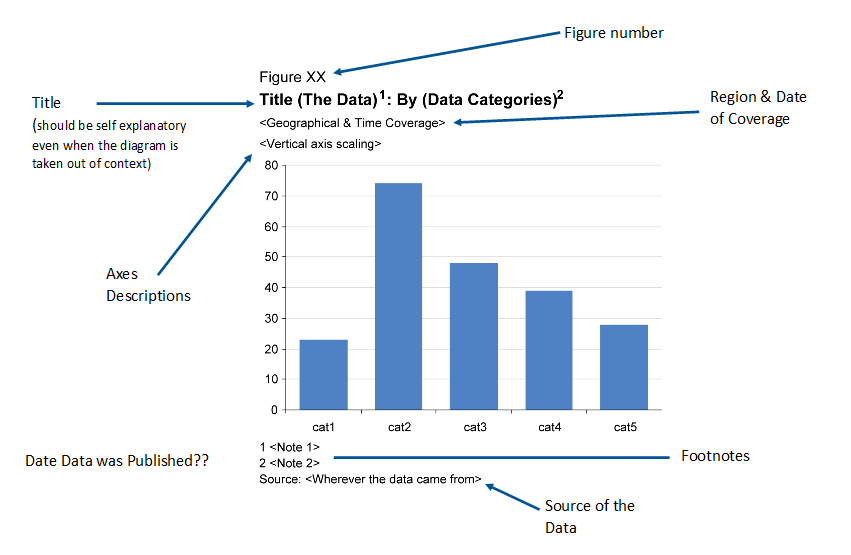
Graphs

You should use graphs to demonstrate a point to your audience, especially if they are not expert users. This might mean they are not experts in the subject area or are not used to dealing with data.

The Gestalt principles that we've talked about previously also apply to graphs.

Why use Graphs?

Graphs allow us to organise, analyse and summarise the data. Charts are not good at detail but excellent at:

  • summarising something complex.
  • telling a memorable story.
  • revealing otherwise hidden insight.
  • quality assurance and detecting errors.

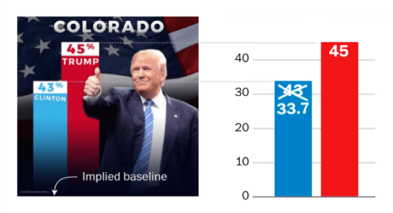
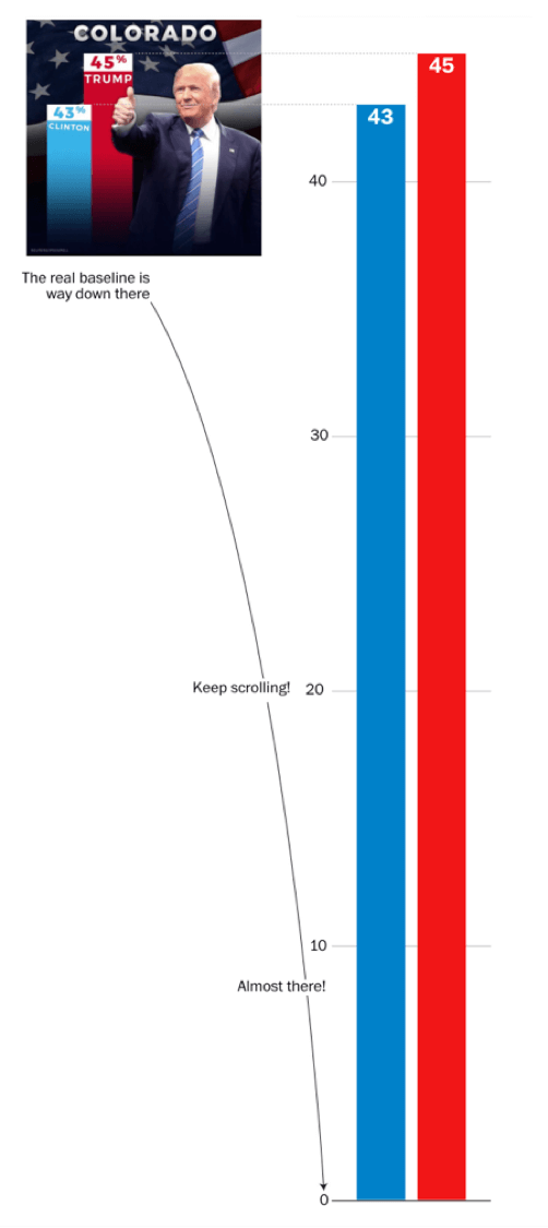
A great example of the power of charts is.....

Datasaurus Dozen

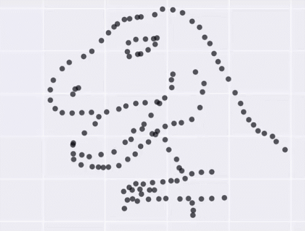
All of the above visualisations have the same set of summary statistics:

  • X-mean: 54.26
  • Y-mean: 47.83
  • X Standard Deviation: 16.76
  • Y Standard Deviation: 26.93
  • Correlation: -0.06

But they all look very different

Graphing tips

Earlier we showed a useful resources for choosing the correct chart. Now we will go through some tips and tricks to help you improve your charts and help get your message across to your users. We will also touch on some ways visualisations can be used to disguise and corrupt numbers. These are things you really shouldn't do, unless you really want to be underhand and sneaky!

These will be light touch as there are plenty of other resources out there. For more in depth chart design then the Office for National Statistics Chart design is a great website to use.

Rough guide to a chart

[Click image to enlarge]

Simplify

The best advice is to present the data as simply as possible. It’s more important that your user understands your message than using an eye-catching graphic. Below is an example of simplifying a published DWP chart.

Defaults

Simplification does not mean cutting corners. One of the worst things you can do is accept Excel charting defaults. Below is an example of improving a published DWP chart, which seems to use Excel defaults.

Trump's Baseline

The Washington Post pointed out that Donald Trump loves a bar chart. His election campaign posted more than 40 bar-chart graphics showing favourable poll results. Here's the chart the campaign tweeted in October 2016.

If we add a baseline at the bottom of the graphic, the implied scale doesn't match the numbers

Inflation

The chart visually inflates Trump's two-point lead to over 11 points. But if we adjust our scale to match the data, where would the baseline end up? If you click the chart above you can see how tall should the bars actually be.....

Where does it end?

Bar charts?

This is a published DWP bar chart. The improvements show that a bar chart doesn’t really work with small changes in large numbers.

You will notice that the y-axis on the line chart we changed it to also does not start at zero. On a bar chart the consumer is looking at the size of the bars to see what is going on, which is why you can't use a zero baseline. On a line chart the consumer is mostly interested in the trend, so a zero baseline can be used. However, so as not to be at all misleading, a further improvement which we could have made would have been to add a "zoomed out" view of the chart in the corner, to add that extra context in.

Mind the gap

A standard bar chart should have gaps between bars that are slightly narrower than a single bar.

Histograms should have smaller/no gaps to help users see the shape of the distribution.

Grouped bar charts should have no gap between the bars in the group and around a full bar width gap between groups.

These rules are all about the Gestalt Principles: things that are close together are perceived as a group.

Labels

Quite often you see bars labelled with values. Adding labels adds precision and detail.

But graphs shouldn’t be used to communicate precision and detail, tables should.

One or two labels might be useful to illustrate a point but generally, adding labels adds clutter. This distracts from the story of the graph and makes it harder to read and understand.

Line charts

How should we label the lines on our charts? A legend is the default answer but this means users are moving their eyes from one place to another and remembering which line is which. We can “directly label” the lines so our eyes bump into the information. But it depends on the data. When the lines cross over a lot it’s more difficult to label them directly so a legend might be better. If you do need a legend, position it in a sensible place to make things easier for the reader, especially when there are lots of series.

CEREBLOG shows a really good example of this (based on the Darkhorse analytics example gifs):

Small multiples

“Small multiples” are a really good strategy for comparing larger numbers of series which would be far too cluttered on one chart. This means plotting each line on a separate, small chart.

All the charts are on the same scale. You can pick out individual stories and differences between each. We use only one colour. Because we’ve removed a lot of clutter, it’s a really powerful way of showing data.

Below is an example of changing a published DWP chart into small multiples.

Part to whole

Pie charts are the default for showing a “part-to-whole” relationship. But they only make it easy to judge the magnitude of a slice when it is close to 0%, 25%, 50%, 75%, or 100%.

Any percentages other than these are difficult to discern in a pie chart, but can be accurately discerned in a bar graph, thanks to the quantitative scale.

Once there are more than two or three slices, they can be hard to read. And comparing pie charts can be really challenging.

This example (from Darkhorse analytics) is a bit tongue in cheek but demonstrates the power of bar charts, even for showing percentages.

Mapping

Maps are excellent at showing geographical breakdowns. There’s a lot of expertise needed to create great maps – we won’t go into that here, just show an example. The Department for Work and Pensions has been making more use of maps with the Universal Credit interactive map.

End of this part of Chapter Four

So we know what our chart/table should look like, but do you make sure your consumers have the right level of help?

That's what we'll cover in Chapter 4.4: Annotations