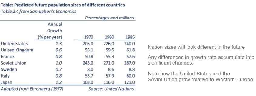
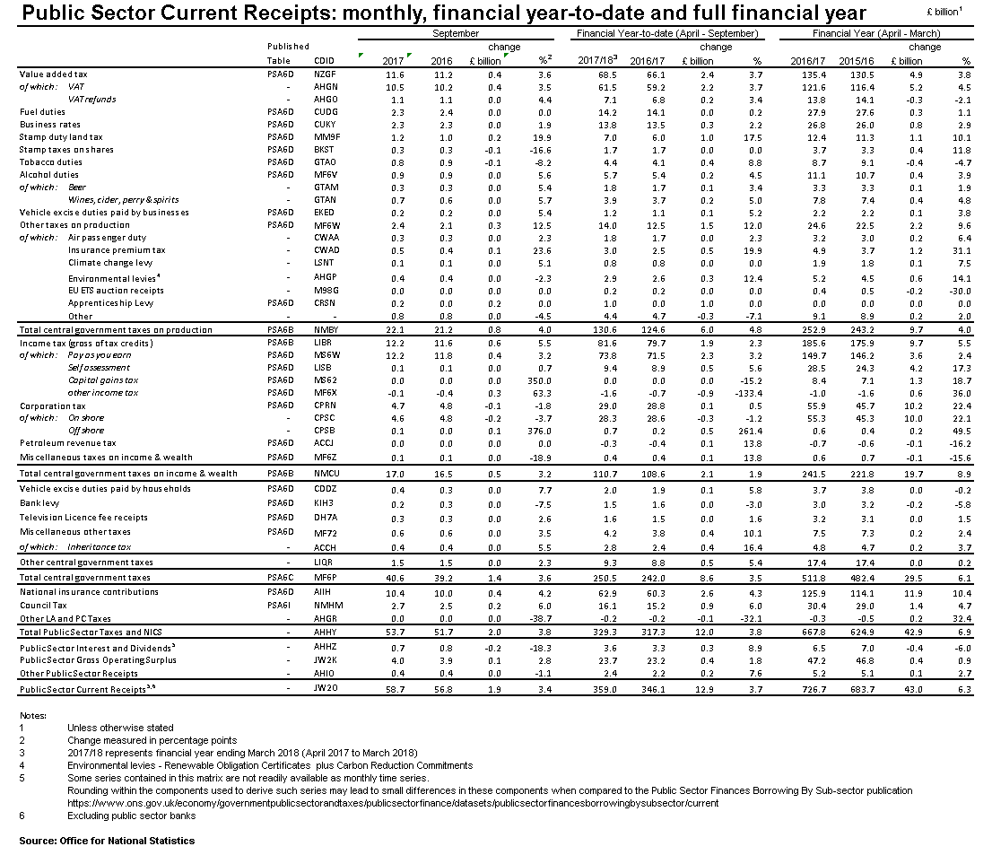
Tables

Tables are used to present numbers in a clear and systematic way.

Tables are a good choice when you want to:

  • look up or compare individual data values.
  • present a very precise level of detail.
  • show only a small number of data points (or a very large number).
  • show more than one type of value e.g. percentages and frequencies.
  • combine summary and detail information in a single display i.e. to show values and their sums.
  • show data with a large range of values. E.g. if the minimum value is 10 and the maximum is 10,000, a graph will probably not show the minimum value clearly.

Reference Tables

There are two types of tables: Reference Tables and Demonstration Tables.

Reference tables are designed to make it easy for readers to look up specific values of interest. They typically have a large number of entries covering a wide variety of different statistics broken down into different categories. They are usually supplied away from the main commentary in an appendix or an accompanying spreadsheet.

[Click image to enlarge]

Demonstration tables

As the name suggests, demonstration tables are used to demonstrate a point that we are trying to get across. The design should ensure that the patterns, and exceptions should be obvious at a glance.

Demonstration tables can be short and simple because they should be used to make a point or an argument so you only need to use the numbers that convey your point. It’s good to match the demonstration tables closely with the commentary. The point should be obvious so the reader gets the “Ah yes, I see” reaction. It is often useful to have a few demonstration tables as opposed to one large table that is trying to show a few things as often the messages will be lost.

It is worth noting that if you do choose to use a demonstration table, you can refer to the full data table (if available) in the footnotes underneath.

[Click image to enlarge]

Table Formatting

Once you’ve decided whether to present a demonstration table or reference table, you need to think about how you are going to lay it out.

It's important to consider principles of visual perception when designing tables.

Some of what we are about to cover is based on The Gestalt principles which describe the different ways in which people perceive groups of objects. These principles were the results of research by the Berlin School of Psychology which aimed to find out how humans perceive patterns. Gestalt is German for ‘shape’ or ‘form’.

An example of the 6 Gestalt principles are shown in the gif below:

Improving tables

Dark Horse analytics created a fantastic gif showing best practice in table design. It shows some very simple improvements you can make to change a cluttered table into one that is easier to read, more professional looking, and clearly highlights key messages.

End of this part of Chapter Four

So now we know what a table should look like but if you want to chart the data what should it look like?

That's what we'll cover in Chapter 4.3: Graphs