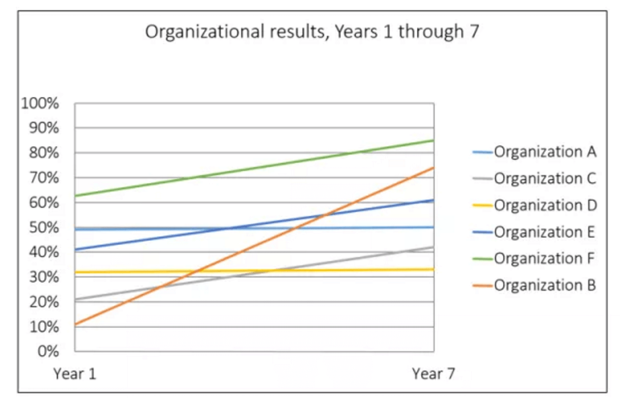
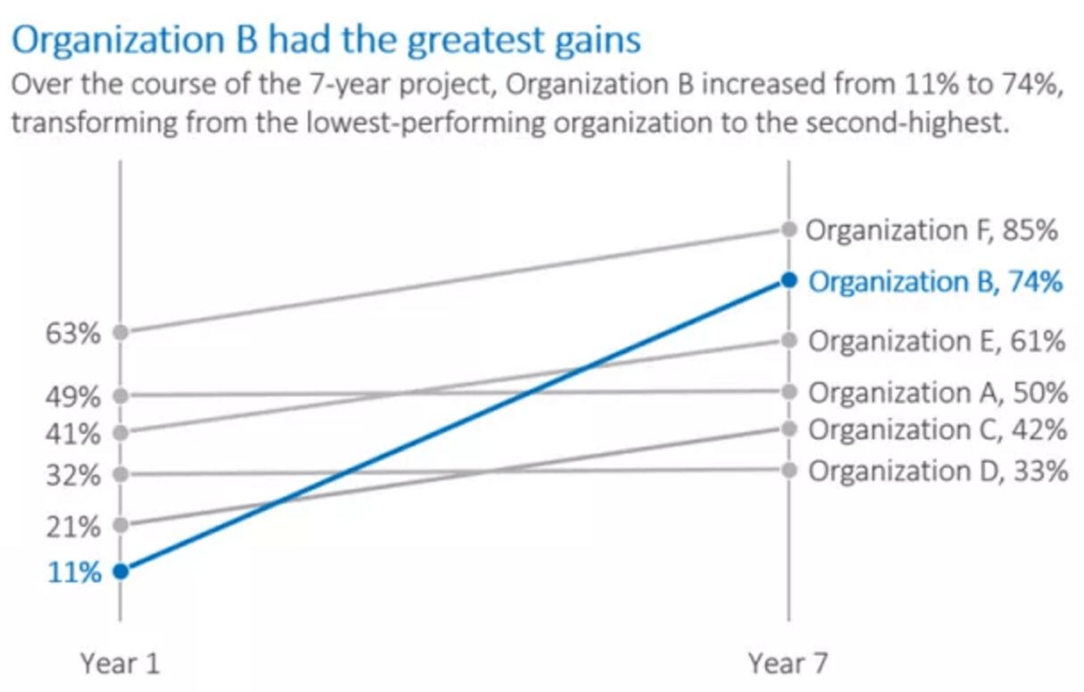
Some things can be quickly understood...
Chance of Winning Presidency
[Click image to enlarge]
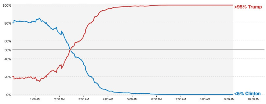
Presidential hopes:
This simple chart captures a moment in history. As more results came in on the night of the US Presidential election, the prospects of the two candidates reversed dramatically. The chart requires very little explanation.
...others take slightly longer…
[Click image to enlarge]
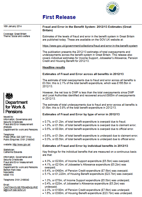
Brexit - who voted 'leave':
This chart is a little more complex, so an active title and brief explanation are provided. Annotations are used to bring out some of the key messages.
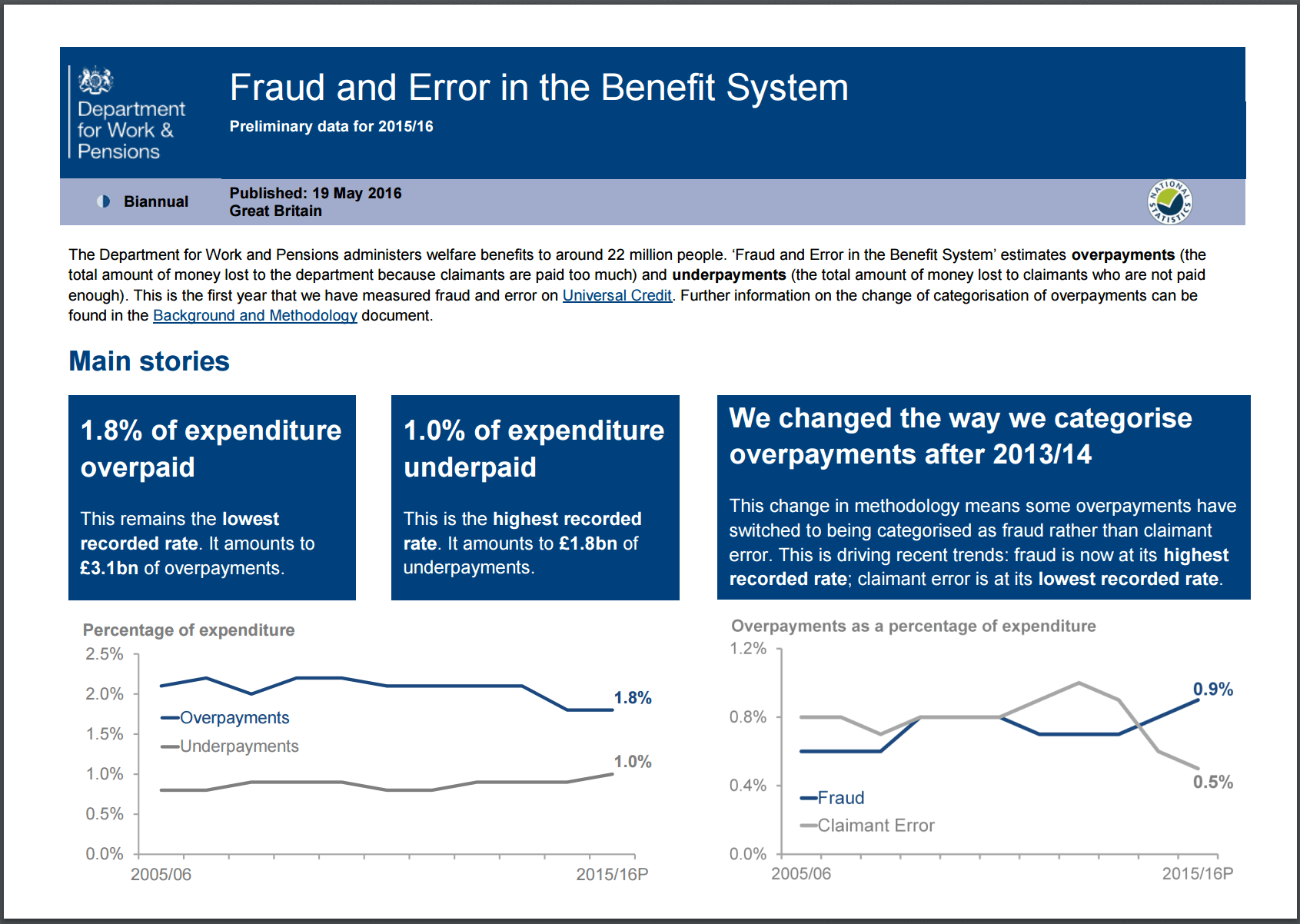
...and some need time to digest...
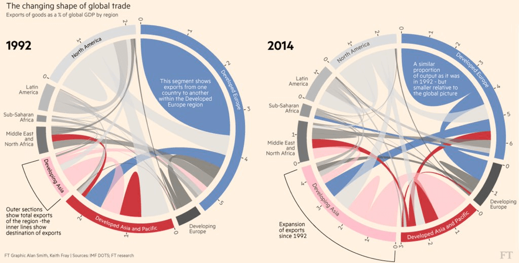
[Click image to enlarge]
Patterns of global trade:
Circular flow charts offer an efficient way of presenting very detailed information. However, such complex charts require much more guidance, explanation and annotation.