Purpose

The aim of this section is to encourage you to think about the aims and objectives of your data visualisation. What are you trying to achieve?

  • Explaining to educate the reader?
  • Informing to help decision-making?
  • Shocking to change behaviour?

As a producer, you need to think carefully about what it is that you want the reader to take away from your data visualisation.

Iraq Deaths

Have a look at this interactive visualisation from Simon Scarr on the numbers of deaths in Iraq, showing the bloody toll of war in the country.

An upside down bar chart showing the number of deaths per year in Iraq. The bars have been coloured red, to give the illusion that the chart is actually dripping blood. The title of the chart is Iraq's bloody toll

[Click image to enlarge]

However if we flip the chart over, change the colour from red to blue and the title to enforce that the number of fatalities are decreasing, we present a completely different message.

This is exactly the same chart as before with the bars now going up and the colour changed to blue. The title of the chart has also been changed to Iraq deaths on the decline.

[Click image to enlarge]

4. Define what success looks like

Identify what type of understanding you're hoping to achieve.

Experience

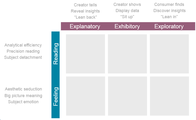
Storytelling is often held up as what data visualisation is all about, but storytelling is just one method to achieve understanding as stories can emerge. There is a difference between storytelling and story forming - where the interpretation and comprehending are left to the consumer. Story forming is a valid tactic in visualisation but it should be intentional. It's a choice about the experience you want the consumer to have.

Explanatory

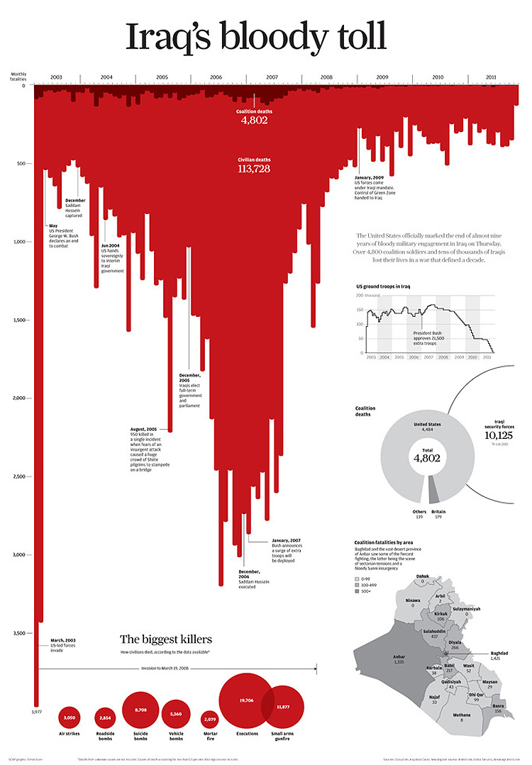
In EXPLANATORY visualisations, the most relevant, interesting and worthwhile insights are PRESENTED to the consumer. Creating explanatory visualisations relies on the creator articulating what is insightful- and why - to others. Explanatory visualisations are best-fit solutions when saying nothing is not good enough i.e. when a take-away message is needed. A good example of this is our national statistics publications - where we explain the key messages in the data to the public, or newspaper articles.

An example of an explanatory visualisation is the Iraq war deaths visualisation at the start of this chapter

Exhibitory

EXHIBITORY visualisations have no explanatory element so consumers have to do the work to interpret meaning and no exploratory element means no scope for interrogation. They are visual displays of data which may be suitable but relies on assumptions of the target audience being sufficiently knowledgeable. Exhibitory visuals may intend to have the explanation provided in person - so an exhibitory visual in an explanatory setting. However most visualisations fall into this void when actually they need to be more functionally explanatory or more often supportively explanatory.

An example of an exhibitory visualisation is Giorgia Lupi's visualisation on fashion

Exploratory

EXPLORATORY visualisations differ from explanatory in that they are focused on helping the consumer find their own insights. There is no assistance to form meaning about good vs bad. The interpreting and comprehending are left to the consumer and so are suitable if the audience has the necessary foundation knowledge. These are almost always digital and interactive.

Examples of exploratory visualisations are the ONS's interactive visualisations

Tone

Reading

This end of the spectrum is about optimising the ease at which consumers can accurately estimate the magnitude and relationships between values and efficiently perceive the data. There may be no need for aesthetics; this may be about general sense making and accurate point reading. Most visualisations are up this end.

Feeling

Offers a contrast where emphasis might be on the gist of the values and a general sense of what the data shows.

We have already seen with the visualisation example on Iraq Deaths that a slight change in feeling of a chart can change the take away story of what the data shows.

Experience and Tone

When you bring together experience and tone together you get a purpose map.

This is a 3 by 2 matrix with the two tones mentioned before as rows and the three experiences as columns

5. Remember, you can't please everyone!

Even with the simplest dataset there isn't a perfect solution, it requires judgement and empathy. People are unique and will bring personal characteristics and emotions which influence their engagement.

End of Chapter Three

We now know who - our audience. We also know why we are presenting the information.

But how do we do it?

That's what we'll cover in Chapter 4: Design